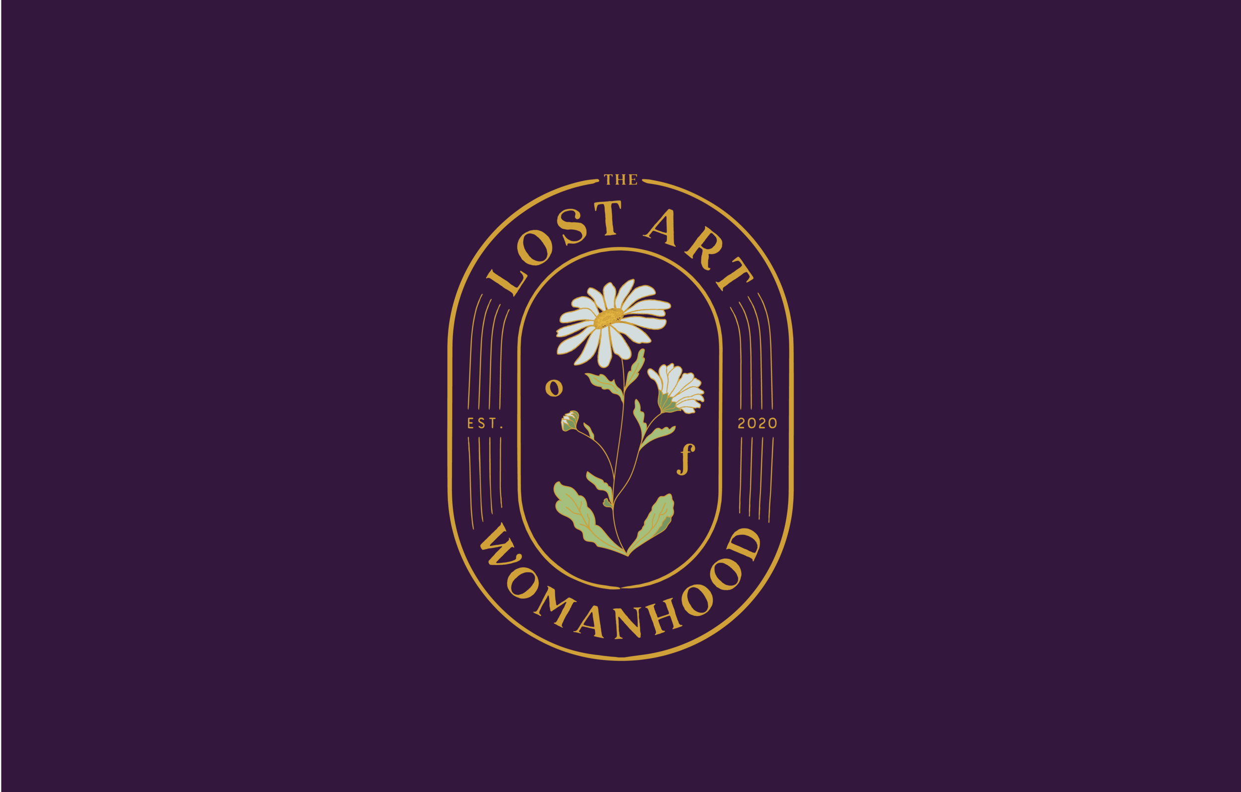

The Lost Art of Womanhood
The Lost Art of Womanhood brand is vibrant, feminine, and nostalgic. There is something both sensitive and powerful about it as we use a favorite staple of Carrie’s, which is a daisy. We add in a touch of filigree ligatures to tie the brand logotype together in a beautiful throwback to art nouveau signage.
The branding resonates as an ode to the feminine mystique by reflecting an aesthetic narrative to a simpler, more playful time in a woman’s youth. However, the use of bold typography is able to work in stabilizing the brand as a powerful entity alongside the more delicate details of the aesthetic. These typefaces use both a thin and traditional serif to play into familiarity, while our bold header type provides a much-needed modern element. Lastly, a simple script option ties together the font selections perfectly as a personalized touch on various branded materials.
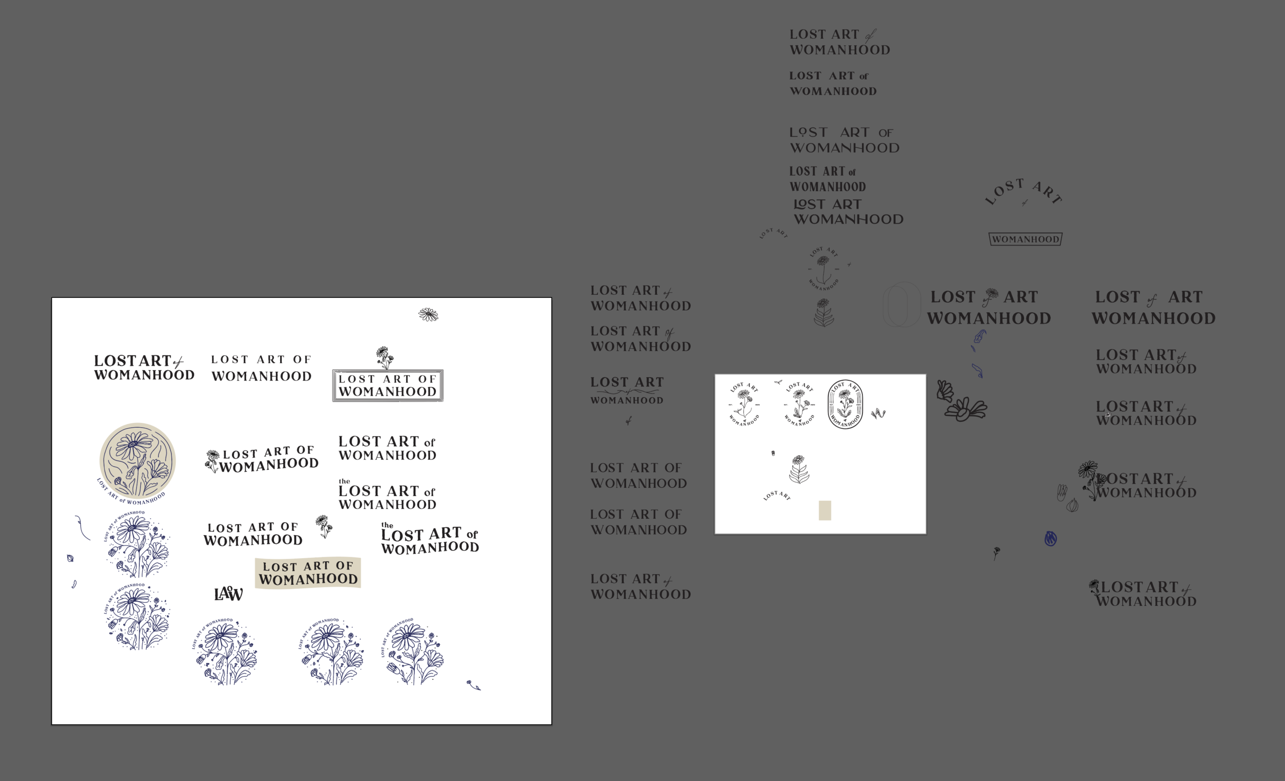
Logotypes

Pattern & Typography